Coastal Blue Guest Bathroom
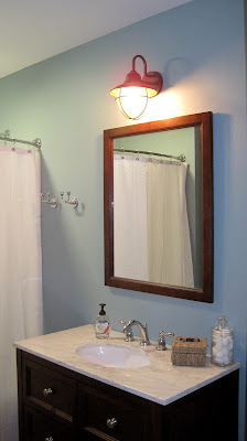
We are head over heels for this bathroom! I wish it wasn't our guest bathroom and soon to be kids bathroom. The blue color on the walls are by far our favorite wall color in the house. I think another reason for our love of this bathroom is that we picked out and found most of the finishes our selves. We got a great deal on the vanity, which included the top, all the hardware and the mirror.
I knew I wanted a crisp white shower curtain for this bathroom. I think it gives a fresh, light feel to the bathroom. This is the only room in the house that doesn't have a window, so we wanted to make sure it didn't feel dark.
We went with a curved shower rod for around 20 bucks at our local home improvement store and we grabbed two shower hooks in a matching chrome finish for around $13 each hook. The chrome matches the knobs on the vanity and the faucet.
Hey, it wouldn't be a proper bathroom with out a toilet right! We went with dual flush toilets in all the bathrooms. This one is by American Standard in white ceramic.
The inside of the tub/shower combo. We went with a plain white surround for both the bathrooms (just not in the master bath). It has plenty of shelves for storing body wash products and a big tub for bath time.
We tried to keep a nautical feel for the bathroom. I think the blue walls dictated the style for the bathroom. The wall color along with a white marble vanity top and white trim, makes the bathroom feel like a coastal retreat! We have plans to add some art work to the walls soon, I am thinking maybe something in black and white with anchors.
The vanity in this bathroom required an 8" spread for the faucet, making this faucet the most expensive one we have of the 4 in the house. 8" spread faucets are generally more expensive than 4" spreads. The spread refers to the distance from handle to handle. We accessorized with items we already had, a glass jar for cotton balls and a rattan basket I have had since college.
This photo shows the flooring in the bathroom. We went with a click down vinyl tile called Star Loc. You can glue it down, grout it or just click them together. We went with large rectangular tiles in a staggered brick pattern. I love real ceramic tile but unlike tile, this isn't cold under your feet and the installation cost was much lower than tile.
We have a skinny linen closet next to the toilet. Right now it is 100% empty but it has the potential to store all the towels and kiddie bath toys that we could ever have. We plan to add some inexpensive wire coated shelves in the closet and a hamper for used towels.
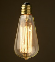
This wall sconce was exactly what we were looking for in this bathroom. AND we got it at the hardware store for only $19.99. We just were not finding what we were looking for when it came to lighting for this bathroom, until we checked out the outdoor lighting section. This lamp has seeded glass and we added a vintage inspired bulb called an Edison bulb.
The bulb will burn an image in your eye for a good minute if you stare at it... but it looks really cool! We have CFL's (compact fluorescent light bulbs) in all our light fixture because they are more energy efficient than incandescents. This light fixture is the only exception in the house. The bulb was also pricey, around $10 for one light bulb and it doesn't have the long life expectancy of the CFL's. All that said, we love how it looks in this bathroom.
Here is a view of the bathroom with the wall light on. You can see the exposed bulb in the light. Don't stare for too long!
We are so happy with how this bathroom turned out. It is fresh and light, even with out any natural light in the room. I also love that this room is 97% done, leaving us to tackle the many other rooms in the house that still need some lovin'.


Do you remember where you purchased the vanity from?? Love it.
ReplyDelete